“First of all, there really aren’t rules! That is, the decorating police will not arrest you for making a mistake in your décor. The neighbors might talk if you painted the whole house orange, and the authorities might object to a fire hazard. But most of us aren’t in danger of these extremes. What we want are a few basic guidelines for tasteful and inexpensive decorating.” ~E. Barnes and Y. Brogger
As a decorator, I have my own rules of thumb when it comes to decorating. I always try to keep in mind that these are rules of thumb and guidelines for me to use…..not rules written in stone. So many times clients have told me, “I read somewhere, or someone told me that pictures should be hung at eye level.” Eye level for me, 5’ 7”, and eye level for my brother, 6’3”, are two very different levels. A rule of thumb or guideline: Artwork that will be viewed while standing, like in a hallway, should be hung approximately 60” from the floor to the middle of the height of the picture. Artwork hung in a room where people will almost always be seated should be 56” to 57” from the middle of the height of the picture to the floor. Adjust accordingly, but this is the average and should be comfortable for most people.
Preconceived decorating rules that have come from decorating books, magazines, HGTV, Pinterest, a friend, or even our mothers may need to be broken. Not long ago I came across an article that I had saved: “Decorating Rules Made to Be Broken” by Emilie Barnes and Yoli Brogger. I am sure you have heard some of these listed below and would agree….they may need to be broken.
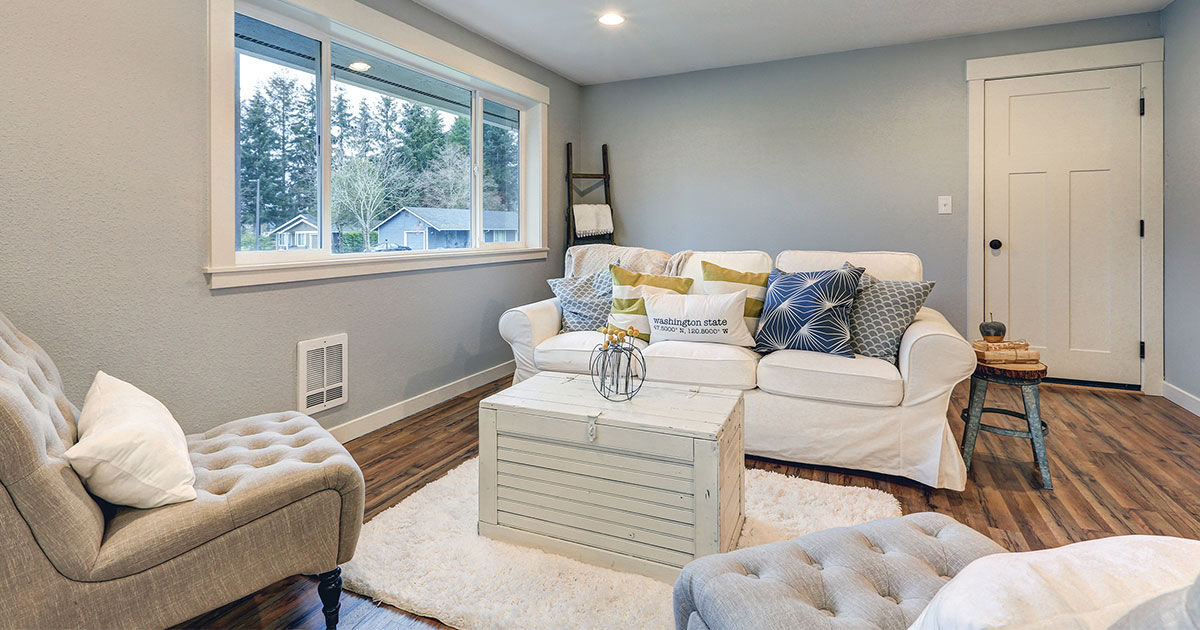
- “Don’t use white….it shows dirt.As long as they’re washable and bleachable, pure white slipcovers, curtains, towels, and rugs can actually be the most practical accessories of all. However, use care when making everything white because it may not always be practical.
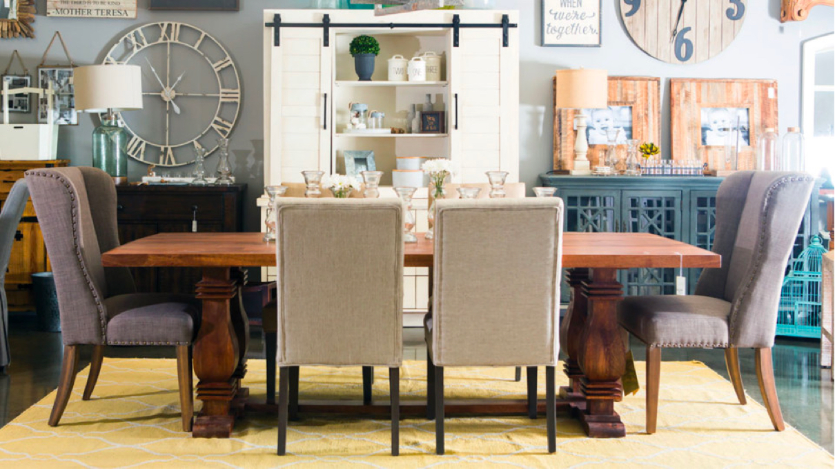
- It all has to match. In fact, a mix of styles, colors and periods of furniture can be visually exciting. Just try to have a common element, such as a color or design motif, to tie them all together. Too much “matchy” can be boring.
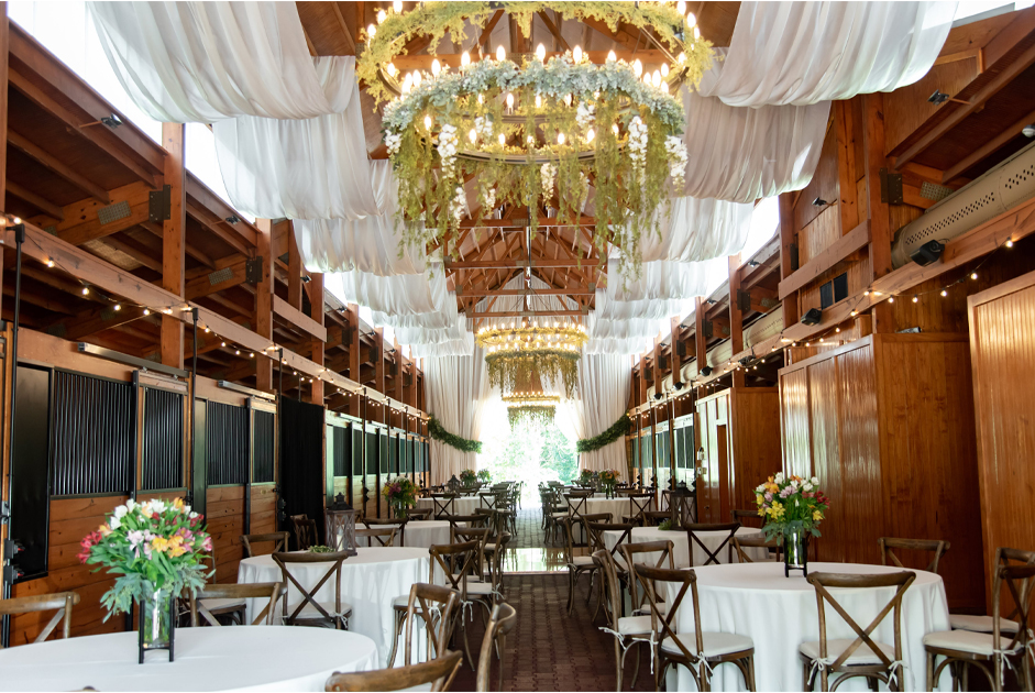
- You need a round cloth for a round table.Draped beautifully, or even tied up at the corners, a square or rectangular cloth will do just fine on any table.
- You need a sofa, a chair, and a coffee table. Try to get rid of your preconceived notions about what you “ought” to have in a room and think how the room is to be used. Remember, function is the main consideration.
- When in doubt, use beige; it goes with everything.The grain of truth in this common assumption is that neutral colors can be very relaxing and usually blend easily with other colors. Beige is far from the only neutral! Any “earth color”…white, black, gray, brown, terra-cotta and especially green and blue….can serve the same purpose and is far more interesting.
- The sofa goes against the wall. Not always! Instead of lining up the furniture square against the wall, you might try setting some pieces at an angle or creating small conversational groups away from the walls.
- Paint small rooms pale colors to make them look bigger.It’s not necessarily bad to paint your tiny study a dark color. The dark color can emphasize its cozy character and make it more interesting. Painting a large room a pale color can emphasize its airiness. Think of the statement you want to make, not what rules you’ve read.
- Anything goes.Break a few rules but keep in mind that the principles of balance, harmony, and comfort still prevail.”
A consultation with Ava is chock full of information you can use right away. The result is easy to live with changes that can jump-start your decorating projects while stretching your decorating dollars. Give Ava a call to schedule an appointment.
